Industry
Technology
Client
TechBees
Ready. Tech. Go.

The Hive with a New Look.
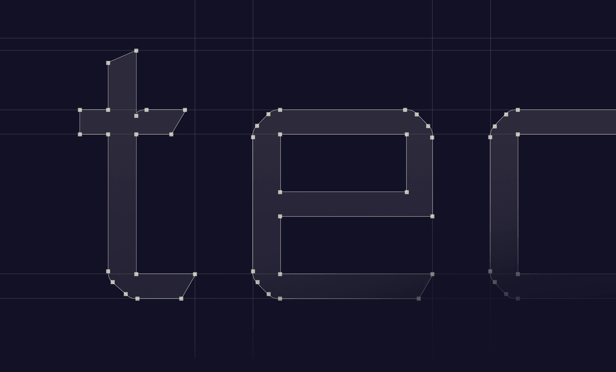
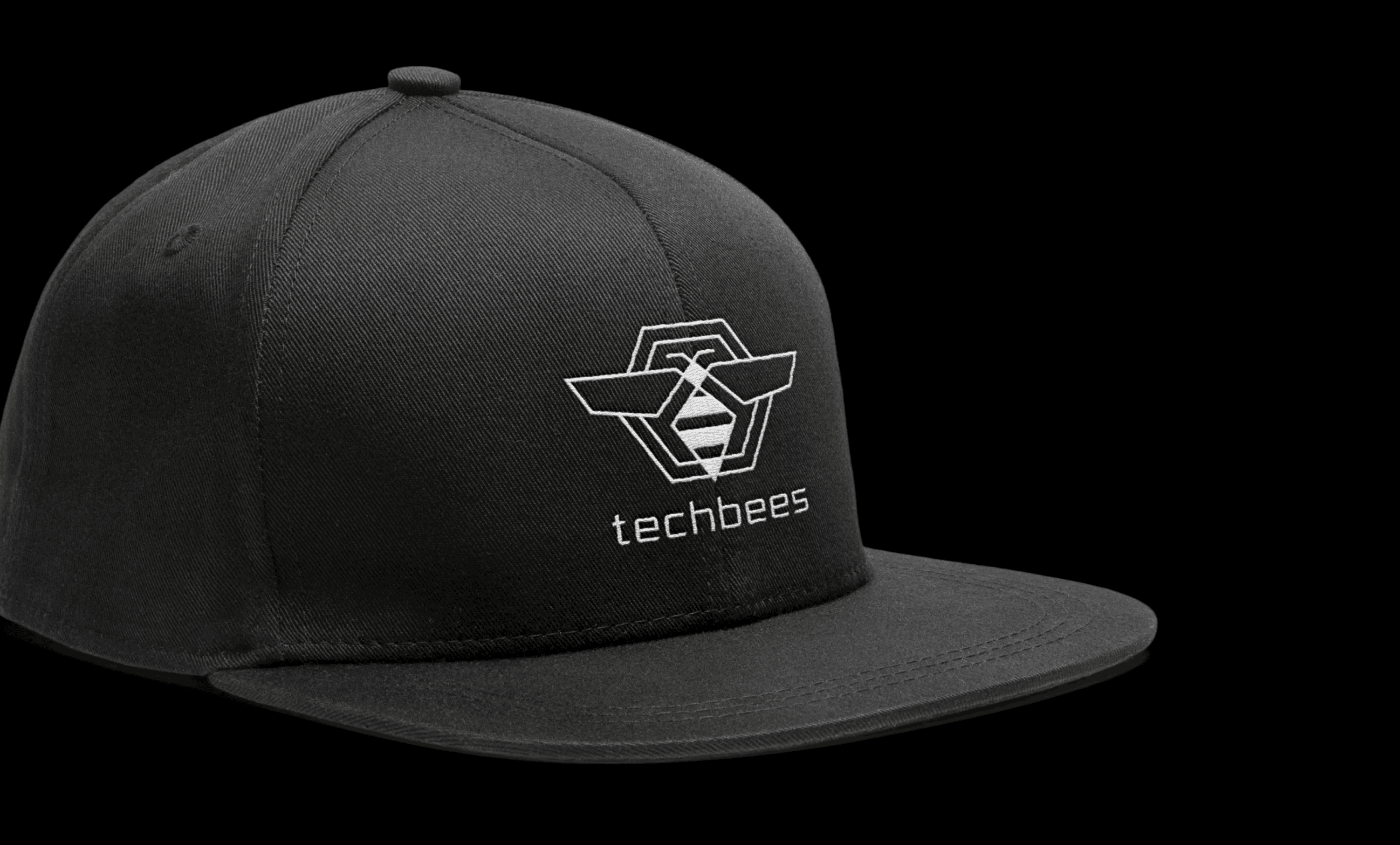
TechBees is a lean tech consultancy helping business owners cut through the noise — connecting them to the right telecom solutions, custom tech stacks, web security, and business technology consulting. Built from scratch, the brand needed to appeal equally to scrappy startups and established companies, projecting the kind of sleek, modern confidence that signals expertise without feeling corporate or cold. The strategy was to engineer the identity the same way TechBees approaches technology — with precision and purpose. The mark was constructed on a hexagonal grid framework, merging a bee silhouette with geometric wing and circuit-like forms to create something that feels built, not drawn. The wordmark followed the same logic, using a heavily modified typeface to echo the angular, technical character of the mark. The full system extended across a logo package and guidelines, color palette, typography, custom iconography, homepage design, pitch deck, marketing collateral, ad styles, swag, and business cards — with motion brought to life in Unicorn Studio and Framer. Tools used include Figma, Adobe Creative Suite, Jitter, Unicorn Studio, Framer, and various AI tools.