Industry
Online Auction Platform
Client
Proxibid
Where Bidders Meet Auctions

The Auction Platform, Rebulit for What's Next.
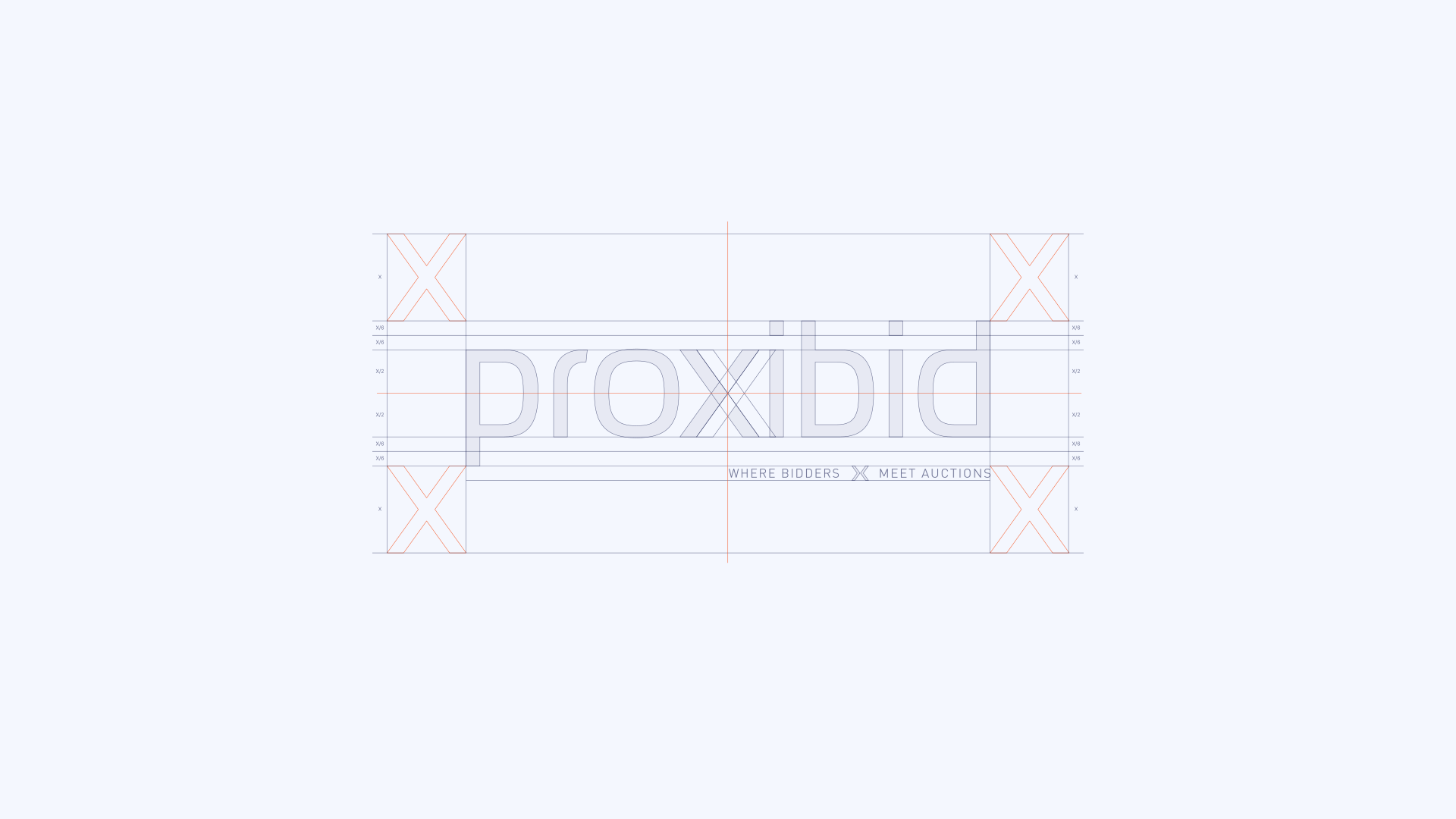
Proxibid is North America's largest online auction marketplace, connecting over 2 million monthly visitors and buyers from 190 countries with 4,000+ sellers across 16 categories — from heavy construction equipment and farm machinery to classic cars and collectibles. The existing brand had fallen behind the scale of the business: dated, generic, and carrying the visual weight of early web 2.0. The rebrand needed to match the platform's actual authority and make it feel like the industry leader it already was. Serving as lead brand designer, the work began with a full brand strategy — anchoring the identity around dependability, transparency, and expertise — before moving into execution. The new wordmark was built with the same proportions as the legacy logo to preserve brand equity, with the stylized "x" at its center functioning as the conceptual heart of the brand: the precise point where bidders meet auctions. DIN Condensed and Roboto were paired to balance industrial authority with digital clarity, while a dual-purpose color system separated promotional and functional UI applications. The full system spanned logo and guidelines, color palette, typography, custom iconography, tone of voice, marketing collateral, advertising, brochures, welcome kits, pitch decks, email templates, signage, business cards, and swag — with UI style recommendations developed in close collaboration with the UI team lead to extend the brand into a full design system. Tools used include Figma, Adobe Creative Suite, Jitter, and various AI tools.