Industry

Online Auction Platform

Client

i-Bidder

i-Bidder Rebranding -
Main Project Image

Big Brands. Bigger Deals.

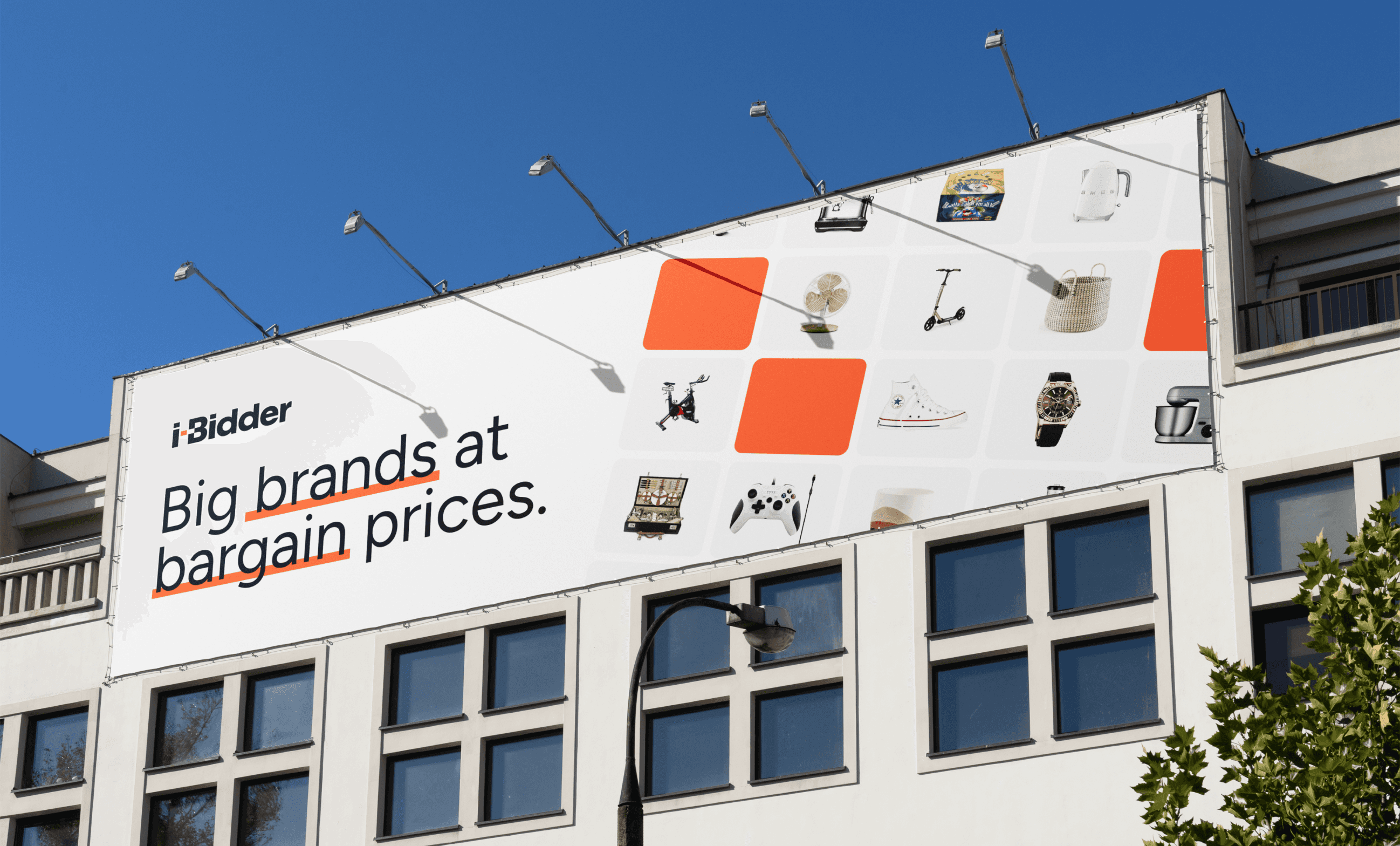
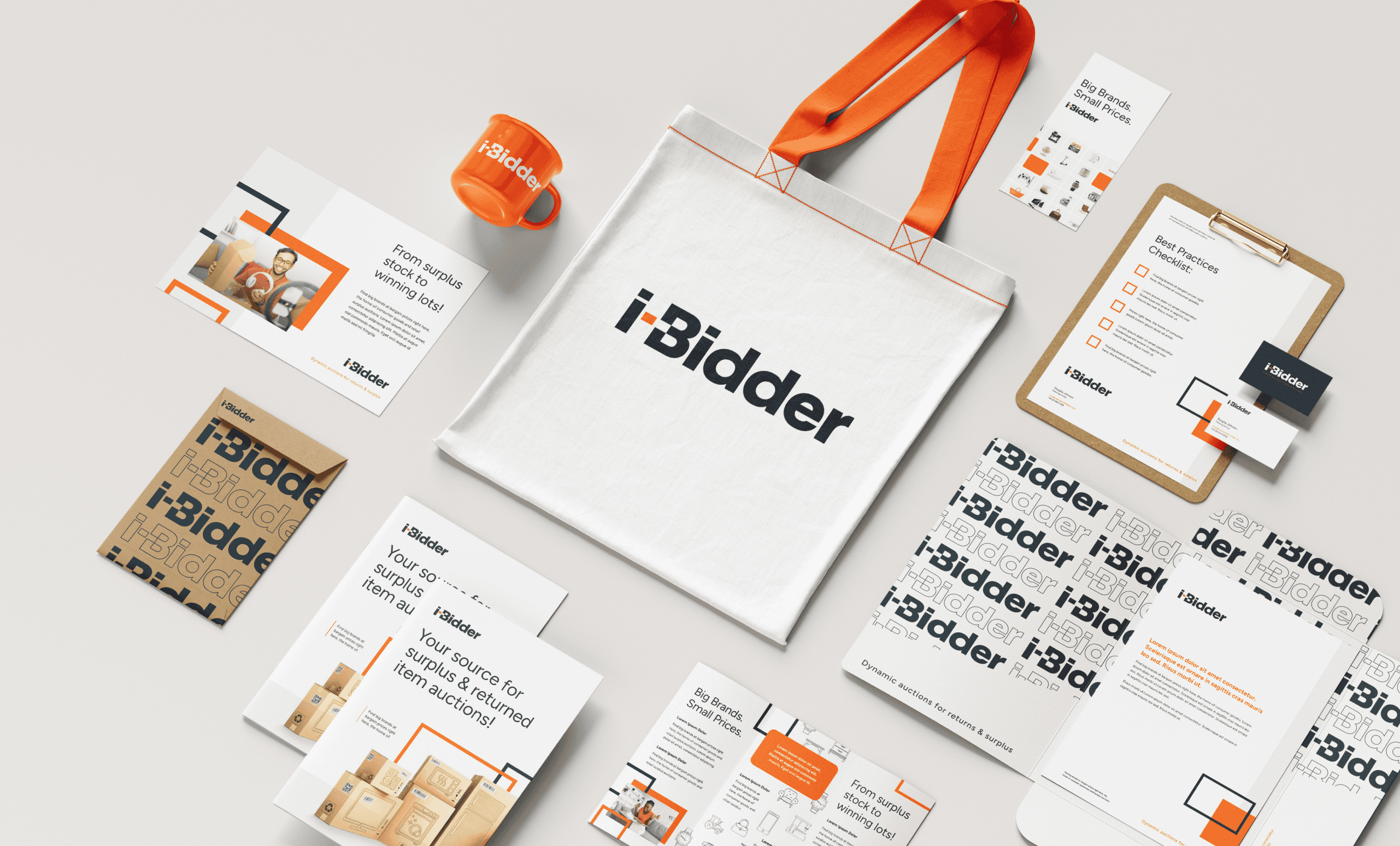
i-Bidder is the UK's largest online auction marketplace for retail surplus, wholesale stock, and consumer goods returns — connecting everyday bidders with big-brand products at exceptional prices. The existing brand was dated, visually stale, and failing to build the trust needed to attract both serious auctioneers and qualified bidders. The rebrand needed to fix that without abandoning a name with years of market recognition. The strategy was to modernize the identity into something bold, accessible, and unmistakably consumer-facing — a clear departure from the old look while retaining the core name. The hyphen became the conceptual anchor of the identity: a visual nod to a surplus lot being pulled from a marketplace, with the "i" representing the individual bidder and the "B" the broader platform they're entering. That same logic carried through to the logo animation and informed the tone of the entire system. Deliverables included a full logo package, brand guidelines, color palette, typography, brand voice and tone, custom outline iconography, packaging, collateral, stationery, swag, pitch deck, and UI recommendations. Tools used include Figma, Adobe Creative Suite, Jitter, and various AI tools.

Large Project Gallery Image #1
Large Project Gallery Image #2
Large Project Gallery Image #1
Project Gallery Image for 50% width of the screen #1
Project Gallery Image for 50% width of the screen #2
Large Project Gallery Image #4

A Brand as Dynamic as the Deals It Delivers.

The result is a high-energy identity built to perform across every surface — from branded shipping tape to billboard campaigns to live auction interfaces. Bold orange, clean type, and a flexible graphic system give i-Bidder the confidence of a major consumer marketplace, while the custom icon library and packaging design ensure the brand shows up with consistency at every touchpoint, from the warehouse floor to the winning bid.

  • The image featured in the carousel #1
  • The image featured in the carousel #2
  • The image featured in the carousel #3
  • The image featured in the carousel #4
  • The image featured in the carousel #1
  • The image featured in the carousel #2
  • The image featured in the carousel #3
  • The image featured in the carousel #4
  • The image featured in the carousel #1
  • The image featured in the carousel #2
  • The image featured in the carousel #3
  • The image featured in the carousel #4